

Typography is more than just choosing a pretty font—it’s a narrative tool. Every typeface, spacing choice, and letter style can shape the story your design tells. For freelance graphic designers, understanding typography’s emotional and narrative power can elevate your work, turning simple text into a voice that speaks directly to the viewer. When typography is used intentionally, it goes beyond mere words and becomes part of the visual storytelling, influencing how audiences feel and respond.
Why Typography Matters in Storytelling
Typography has the power to set the tone, capture attention, and communicate values. A bold, all-caps serif font tells a different story from a delicate script. Typography can give clues about a brand’s personality, suggest a time period, or evoke a specific emotion. By using typography as a narrative tool, you can create designs that feel cohesive, resonant, and memorable.
Key Typography Techniques for Effective Storytelling
Let’s explore techniques to use typography as a storytelling element, with practical applications across brand assets, advertisements, and digital layouts.
1. Choosing Fonts that Match the Brand’s Voice
Every font has a unique personality. Serif fonts, for instance, often suggest tradition and reliability, while sans-serifs are modern and clean. Understanding the emotional weight of a font family helps in choosing one that aligns with a brand’s values and message.
Example: Logo Design for a Wellness Brand
For a wellness brand, using a gentle, rounded sans-serif font can create a soothing, approachable look. Paired with soft pastel colors, the font reinforces a feeling of calm and balance, aligning with the brand’s focus on relaxation and well-being.

2. Experimenting with Size and Weight for Emphasis
The size and weight of your text determine its hierarchy. Bold, large type grabs attention, while smaller, lighter text can be used for supporting details. Adjusting font weight creates contrast and draws the viewer’s eye in the desired order.
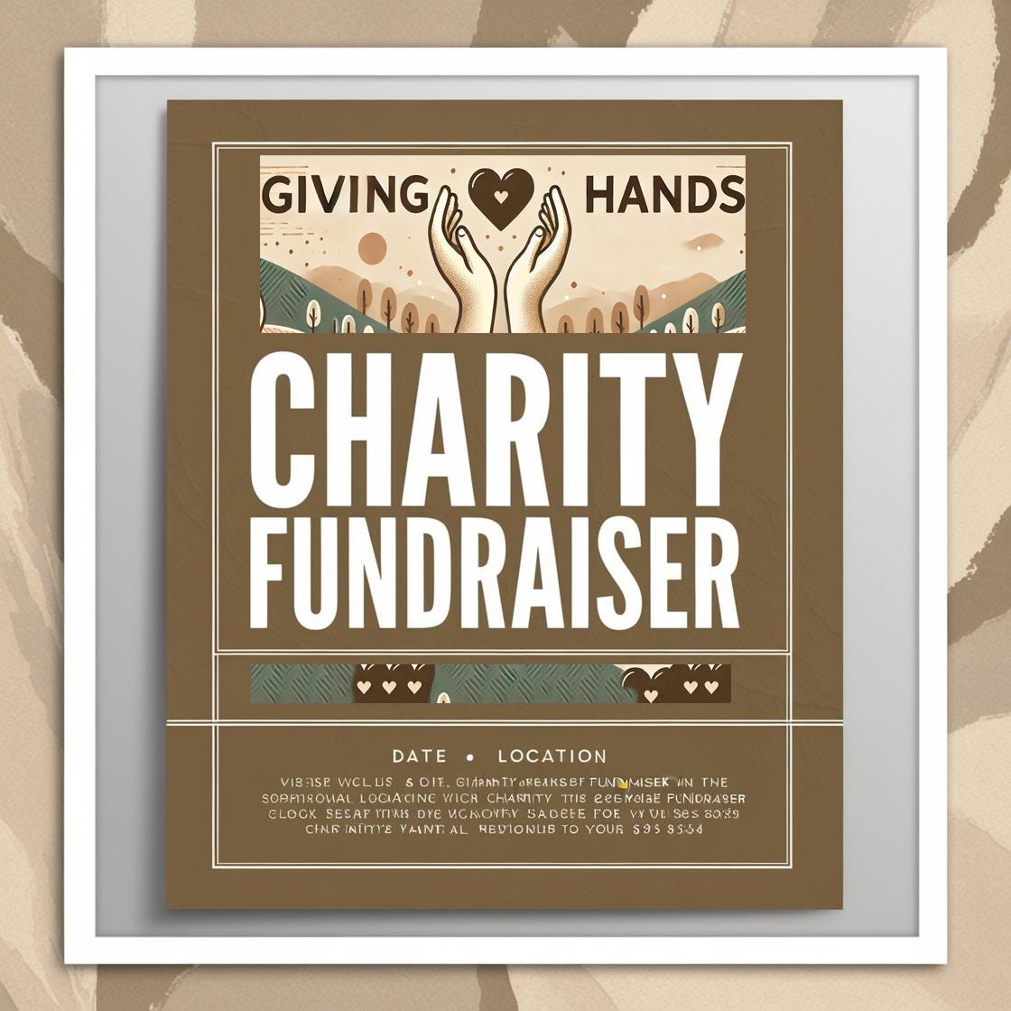
Example: Event Poster for a Charity Fundraiser
On an event poster, use a bold, oversized font for the event name at the top, creating a strong focal point. Below, medium-weight text in a smaller size shares details like the date, location, and purpose. This hierarchy makes sure viewers first see the event name before exploring additional information, ensuring clarity and impact.
3. Playing with Spacing to Control Mood
Kerning (space between letters) and leading (space between lines) can subtly influence the mood of a design. Tighter spacing creates urgency and energy, while generous spacing feels relaxed and open, letting the design breathe.
Example: Social Media Ad for a Luxury Brand
For a luxury perfume brand’s social media ad, use wide letter spacing for the brand name at the top, creating an airy, elegant feel. Beneath, space out the product description with increased leading, letting each line breathe, emphasizing sophistication and exclusivity.

4. Using Color to Reflect Emotion
Color choices in typography influence readability and mood. Warm tones evoke passion and energy, while cool tones feel calm and trustworthy. Bold colors make text pop, while neutral colors let it blend naturally with other elements.
Example: Web Banner for an Eco-Friendly Campaign
For an eco-friendly campaign, use deep greens and earthy tones in typography to create a natural, grounded feeling. A dark green title on a light beige background communicates environmental values and draws attention to the main message, establishing a connection with nature.
5. Incorporating Decorative Fonts for Creative Impact
Decorative fonts, when used sparingly, can add flair and personality to a design. However, they should be reserved for short text, such as headlines or logos, to avoid overwhelming the viewer. Decorative fonts often suggest a theme or style, adding richness to the narrative.
Example: Magazine Header for a Retro Feature
For a retro-themed magazine spread, use a bold, vintage-inspired font for the headline. The decorative typography can instantly evoke nostalgia, transporting readers back in time and setting the tone for the entire article. Paired with a clean body font, it creates a perfect contrast that enhances readability and thematic style.

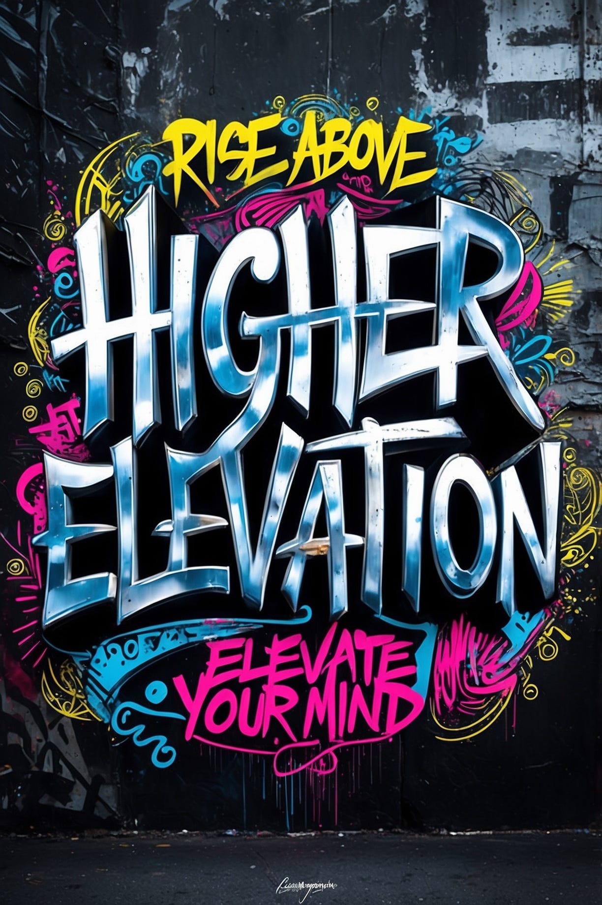
6. Creating a Typographic Composition for Visual Interest
Sometimes, typography can be the star of the design. By arranging type in creative compositions—such as spirals, diagonals, or overlapping letters—you can make text feel dynamic and engaging. Typographic compositions work well for posters, event graphics, or promotional images that require a bold statement.
Example: Concert Poster for an Indie Band
For an indie band’s concert poster, arrange the band’s name in a diagonal typographic layout, with each letter overlapping slightly. Use contrasting colors for visual impact and a mix of bold and light weights to add texture. This typographic layout adds energy, reflecting the band’s alternative vibe and attracting viewers at a glance.
Practical Applications of Typography as a Narrative Tool
Brand Identity: Creating Logos and Taglines
Logos and taglines benefit greatly from typographic choices that reflect brand personality. Consider using fonts that are unique and memorable, reinforcing brand values through type.Advertisements: Enhancing Emotional Appeal
Typography in advertisements should communicate urgency, elegance, or excitement based on the message. Font choice, weight, and color all play a role in setting the ad’s tone.Web Design: Improving User Experience
Clear, readable typography is essential for web design. Using different font weights, sizes, and colors helps guide users through content, making information easier to digest and more engaging.
Practical Tips for Mastering Typography in Storytelling
Limit Your Font Choices
Using too many fonts can confuse the viewer. Stick to two or three complementary fonts to keep the design cohesive and readable.Match the Font to the Message
Ensure the font style aligns with the tone of your message. A playful font works for a children’s product, while a clean, modern font is better suited for tech or business designs.Use Color Strategically
Color should enhance readability and mood without overpowering the design. Experiment with contrasting colors to highlight key words or phrases.Experiment with Creative Layouts
For posters or promotional graphics, try arranging text in unique ways to make typography part of the visual interest. However, always prioritize readability.
Making Typography Your Voice
Typography, when used effectively, isn’t just a supporting element—it’s the voice of your design. For freelance graphic designers, using typography to communicate mood, tone, and message adds depth to your work. Each letter, word, and phrase becomes a brushstroke in your visual story, turning text into an integral part of the narrative.
In our final article, "Creating Cohesive Stories Across Platforms: Adapting Your Narrative for Social Media, Web, and Print," we’ll explore how to keep your storytelling consistent and adaptable across various platforms. See you there!
PS: Typography isn’t just what you say—it’s how you say it.

Share this post