
Hello, design explorers!
Ever wonder how some designs grab your attention right away? It’s not magic—it’s a visual hierarchy at work. Visual hierarchy and composition are powerful tools that let you direct the viewer’s eye, enhancing engagement and ensuring your message hits home.
In this article, we’ll cover the basics of visual hierarchy, explore eye movement patterns, and share tips on arranging elements to enhance readability. Ready to take your designs to the next level? Let’s dive in!
Understanding Visual Hierarchy
What is Visual Hierarchy?
Visual hierarchy is the strategic arrangement of elements in a design, prioritizing information to guide the viewer’s eye. Think of it as a map that tells viewers where to look first, second, and so on.
Influences Perception: It ensures that the viewer sees what’s most important first.
Enhances Communication: Helps convey messages clearly and effectively.
Case Study: A well-designed landing page places the headline and CTA front and center, ensuring visitors know exactly what action to take.

The Psychology of Attention
Eye Movement Patterns
Understanding how people scan a page is key to directing their attention.
F-Pattern: A common way people read text-heavy pages, moving left to right, then down.
Z-Pattern: Found in layouts with less text, where the eye moves diagonally.
The Role of Contrast and Color
Contrast and color help highlight key elements.
Contrast: Dark text on light backgrounds or vice versa makes important items stand out.
Color’s Impact: Warm tones like red and yellow draw attention, while cool colors recede.
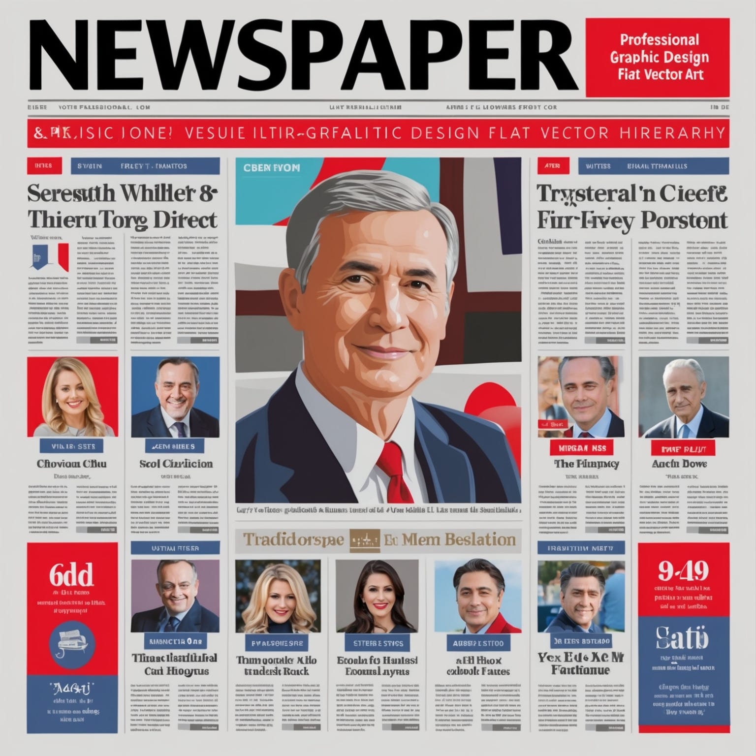
Case Study: Newspapers use bold headlines and color highlights to guide readers through the main stories of the day.
Key Techniques for Establishing Visual Hierarchy
Size and Scale
Size matters in visual hierarchy. Larger elements naturally appear more important.
Where to Apply: Headlines, images, and buttons should be larger for emphasis.
Color and Contrast
Contrast helps create focal points by differentiating elements.
Practical Tip: Use a single accent color to make important details pop.
Alignment and Positioning
Alignment brings order to a design.
Positioning Key Information: Place crucial elements in areas where viewers are most likely to look.
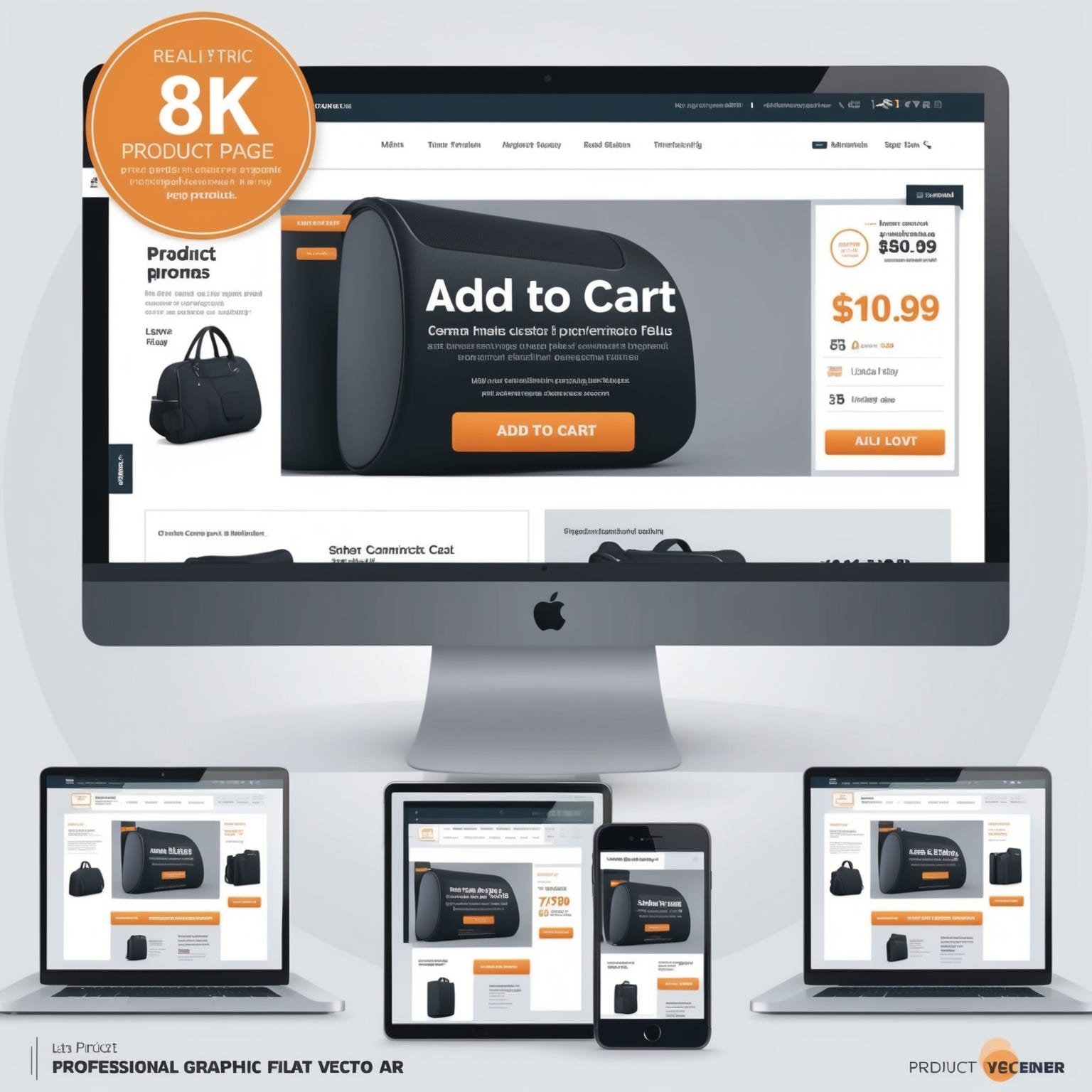
Case Study: Product pages use large images and highlighted CTAs to draw attention to the main product features.
Composition Techniques for Effective Layouts
The Rule of Thirds
The rule of thirds divides a design into a 3x3 grid, creating focal points that are naturally pleasing to the eye.
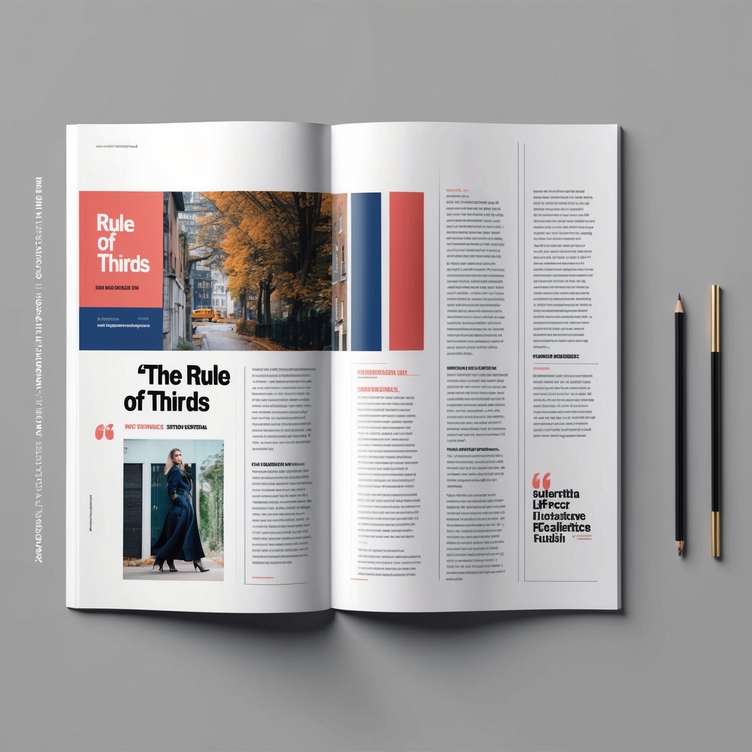
Application: Useful in photography, web design, and graphic layouts.
White Space and Padding
White space, or negative space, gives elements room to breathe.
Benefits: Reduces clutter and makes designs feel more open.
Leading Lines and Paths
Lines and shapes can guide the viewer’s gaze through a design.
Example: Use lines or pathways to direct attention towards the CTA or other focal points.
Case Study: Magazine layouts use leading lines to guide readers through articles, making the content flow naturally.

Practical Tips for Applying Visual Hierarchy
Identify Your Focal Point
Determine the most critical element of your design and make it the focal point.
Align Surrounding Elements: Arrange other elements to support and draw attention to the focal point.
Experiment and Test
Testing can reveal which layouts work best.
A/B Testing: Try different layouts and track which gets the most engagement.
User Feedback: Ask users where their attention goes to see if the hierarchy works.
Exercise: Design a homepage with a clear hierarchy, starting with the headline, image, and CTA.
Conclusion: Mastering Visual Hierarchy for Impactful Design
Visual hierarchy isn’t just about making things look good; it’s about communication. By strategically arranging elements, you create a visual flow that guides the viewer’s experience and enhances understanding.
What’s Next?
"Next up, we’re diving into the psychology of typography with 'Typography Psychology: Choosing Fonts with Purpose.' Discover how font choices shape perception and set the tone for your designs—don’t miss it!"
Join the Conversation
Did this article help you see design in a new way? Share your thoughts on how you use visual hierarchy in your projects!
And don’t forget to subscribe for more insights on crafting effective, impactful designs.
